01
The logo.
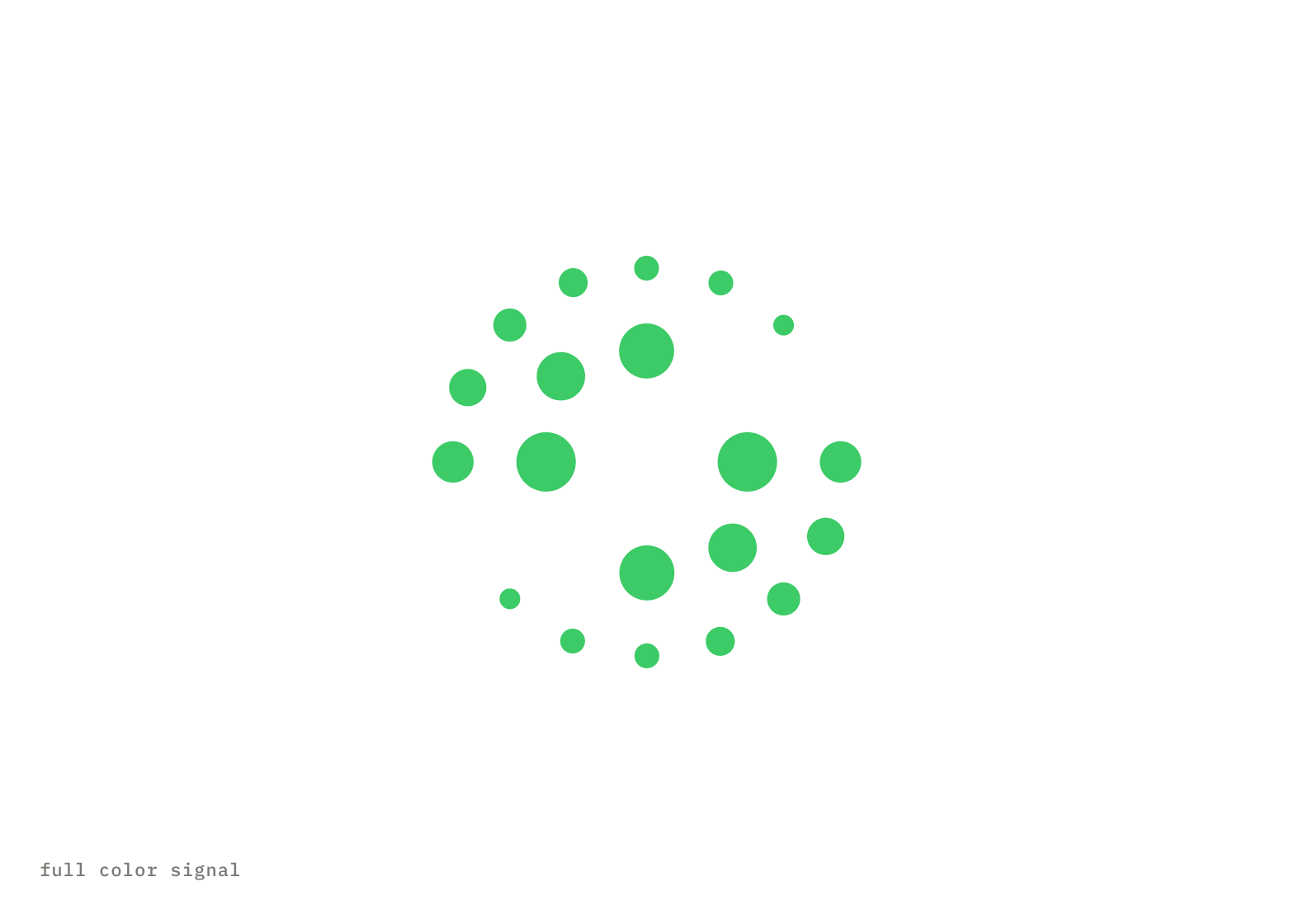
The Salesloft signal is a field of green dots orbiting a single white center point. The white point represents clarity — the signal that emerges when scattered, disconnected data finally resolves into a single clear path. Orchestration made visible.
Signal Mark - Green 600
Logotype - White
02
Anatomy of the signal.
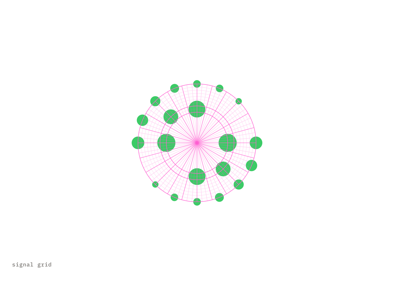
Dots are aligned on a radial grid and taper as they move outwards. They flow in opposite directions of each other to create an “S”.
03
Space & scale.
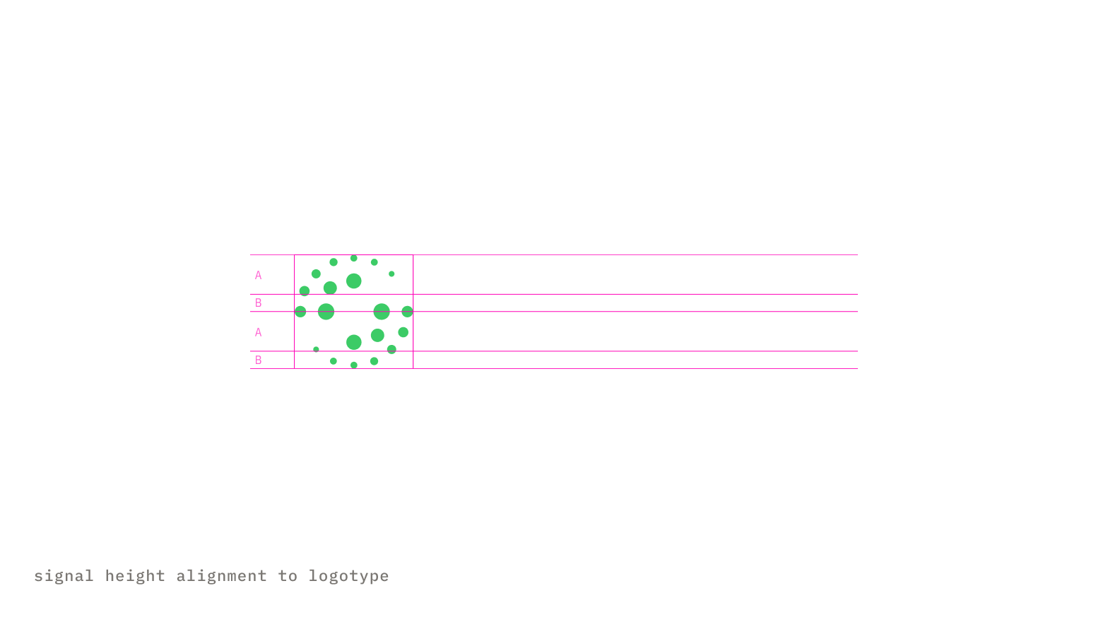
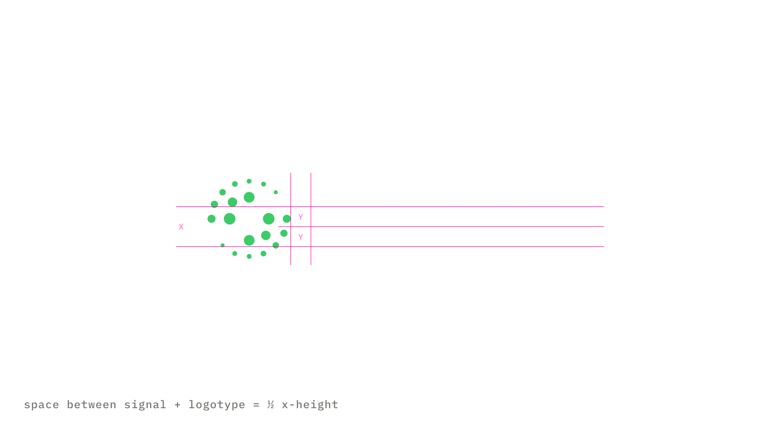
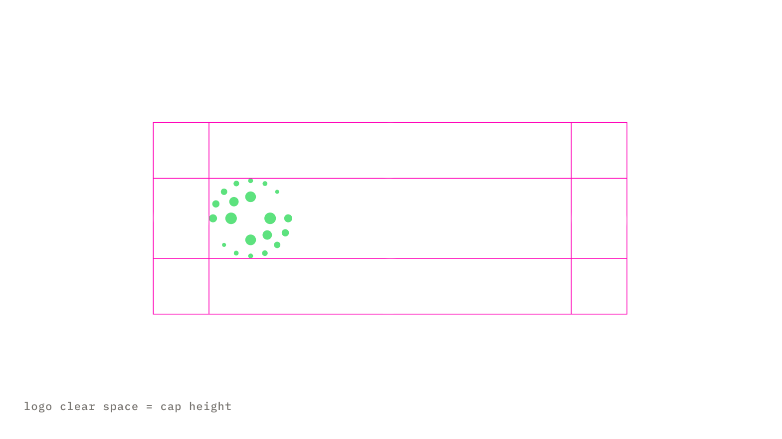
To achieve form balance, the spacing and scale of the logo elements are derived from the values found within the logotype.
The space between the signal and the logotype equals half the x-height.
The clear space surrounding the entire logo is equal to the cap height. This distance is considered the minimum uninterrupted space surrounding the logo.
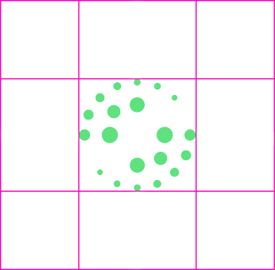
If the signal is ever used on its own, the same clear space guidelines apply to the signal.
04
Color variations.
The full color logo should be used on a dark background as often as possible. Only if necessary, use alternate variations for light backgrounds and single color applications.
on warm 900
 full color logo
on warm 100
 full color reversed
on white
 1 color logo - black
on warm 900
 2 color logo - white
05
Legal variations.
Trademark and copyright versions.
on warm 900
 trademark
on warm 900
 copyright
06
What not to do.
The signal is fixed. These are the failures that turn up most often, and every one of them costs the brand a little credibility.
×
Don’t use unapproved color combinations. The dots are green/600 or in 1-color variants the entire logo can be white or black.
×
Never place it on a low contrast background. Use approved color backgrounds for sufficient contrast.
×
Never crowd or obstruct the logo. Adhere to the clear space guidelines and always make sure the logo is legible against the background.
×
Never add effects. No shadows, gradients, glows, bevels, or outlines on the signal or the logotype.
×
Never add effects. No shadows, glows, bevels, or outlines on the signal or the logotype.
×
Never rebuild the lockup. Signal-to-logotype spacing and scale are fixed. Don't nudge, stack, or re-space it.
07
Assets.
Download the Salesloft logo kit.
Download the salesloft logo

 Brand guidelines · 2026Contact